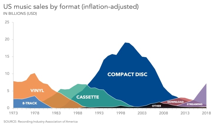
When it comes to making sound business decisions, nothing is more essential than having accurate data at your fingertips. And one of the most important ways to collect data is through the use of charts and graphs. By using them to track your data, you can make sound business decisions that will help your business grow and succeed.
Charts and graphs allow you to track trends over time, compare data across different categories, and spot patterns and outliers. In other words, they provide a visual representation of your data that can be easily understood and used to make informed decisions.
There are all sorts of different charts and graphs you can use to track data, and the type you use will depend on the information you’re trying to gather. Today, we’ll focus on area charts. This article will cover what an area chart is and some examples of when it can be useful to utilize this type of chart.
The Area Chart
An area chart is a graphical representation of data in which the area between two or more plotted lines or curves is filled in with color or shading. It is used to compare values among two or more data sets.
They are essentially a combination of a line chart and a bar graph, making them perfect for comparing values at different points in time. There are two types of area charts: stacked and clustered. Stacked area charts are ideal for showing how different values contribute to a total. Clustered area charts are excellent for comparing values at different points in time. The credit for the invention of the modern area chart is often given to English statistician and engineer William Playfair, who popularized the use of area charts in the 18th century.
Now that you’re familiar with area charts let’s look at some examples of when they’re useful.
To Compare Values Between Different Categories
The area chart is one of the most commonly used charts in data visualization. This is likely due to the fact that it is especially versatile and can be used to visualize a wide variety of data sets. One example of an area chart that’s useful is when comparing values between different categories. For example, you can use an area chart to compare the total sales for different products. This can help you see which products are selling the most and which ones are selling the least.
To Display Changes Over Time

An area chart is useful when you want to display changes over time. This type of chart is perfect for visualizing trends, such as the increase or decrease in sales over a period of time. For example, your business may want to track inventory levels on a monthly basis to ensure that you have an adequate supply on hand. This can help improve customer satisfaction and prevent stock-outs.
When Visualizing Data Hierarchies
Area charts are great for visualizing data hierarchies. For example, you could use an area chart to compare the total number of sales for different product categories within a certain time. This can help you see which categories are selling the most products and which ones are selling the least. As a result, you can make more informed business decisions about which products to focus on.
Utilizing Area Charts in Business
Area charts are one of the most popular data visualization tools in business. These charts offer many different visualization uses and benefits. No matter if you’re looking to compare categorical data sets, changes in data over time, or data hierarchies, an area chart is a versatile and powerful way to visualize data.

